The Four Forces of Progress: Why Users Switch (And Why Most Designers Get It Wrong)
There's a question that keeps product teams up at night: Why do users leave?
Not just churn metrics. Not just "they found something better." The real, structural, psychological reason a human being decides to abandon a product they've been using, sometimes for years, and switch to something new.
I've spent the last decade designing products across fintech, SaaS, and consumer apps. And the single most powerful mental model I've ever encountered for understanding user switching behavior is something most designers have never heard of: The Four Forces of Progress.
It's not a growth hack. It's not a dark pattern. It's a foundational framework from Jobs-to-Be-Done (JTBD) theory that explains, with uncomfortable clarity, why your users stay, why they leave, and what you can actually do about it.
Let me break it down.
The Core Insight: Users Don't Switch Because You're Better. They Switch Because the Forces Are Unbalanced.
Most product teams operate on a simple assumption: if we build a better product, users will come.
So they add features. They polish the UI. They optimize onboarding. They run A/B tests on button colors. And then they wonder why adoption is flat.
The Four Forces framework says the problem was never about your product's quality. It's about the psychological forces acting on your user at the moment of decision.
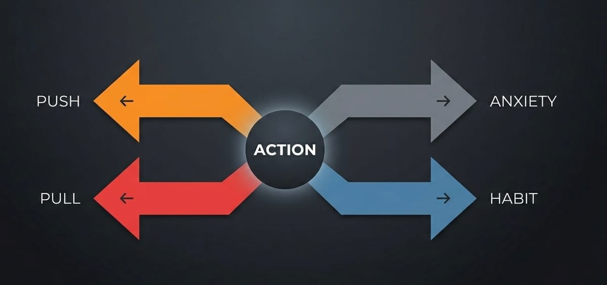
There are exactly four:
- Push — What's wrong with their current situation?
- Pull — What's attractive about the new solution?
- Anxiety — What scares them about switching?
- Habit — What's comfortable about staying?
Two forces push toward change. Two forces pull against it. And here's the critical insight that most teams miss:
This is why users stay in broken products. This is why they tolerate terrible UX. This is why your beautifully designed solution sits unused while they limp along with a spreadsheet from 2014.
Force 1: Push — The Pain of the Present
Push is the dissatisfaction a user feels with their current situation. It's the frustration, the friction, the "this isn't working anymore" feeling that makes them start looking around.
Push can come from:
- Functional pain: The product is slow, buggy, missing key features
- Emotional pain: They feel stupid using it, or it makes them look bad
- Social pain: Their peers have moved on, and they're falling behind
- Financial pain: The cost keeps going up, or they're not getting value
The designer's mistake: Teams over-index on Push. They assume that if users are frustrated enough, they'll switch. But frustration alone is not enough. Users are remarkably tolerant of pain when the alternative feels risky.
Real-world example: ChatGPT users experienced hallucinations, limited context windows, and short-term memory issues. That's Push. Real, tangible frustration. But millions of users stayed, because the other forces hadn't tipped yet.
Force 2: Pull — The Promise of the New
Pull is the attraction of the new solution. It's the vision of a better future, the promise that "this could be easier."
Pull can come from:
- Capability pull: The new thing can do something the old thing can't
- Simplicity pull: It looks easier, cleaner, less effort
- Social pull: Everyone's using it, and it looks good
- Aspirational pull: It aligns with who they want to be
The designer's mistake: This is where most teams spend 90% of their energy. "Our product has better features! Better design! Better performance!" But Pull alone doesn't create switching. It creates interest. Interest is not action.
Real-world example: Claude.ai pulled ChatGPT users with larger context windows, better memory, and fewer hallucinations. That's a strong Pull. But even with a superior product, the switch didn't happen automatically, because Anxiety and Habit were still in play.
Force 3: Anxiety — The Fear of the Unknown
This is the force most designers completely ignore. And it's the one that kills more product switches than any other.
Anxiety is the voice in the user's head that says:
- "What if it's not actually better?"
- "What if I lose my data?"
- "What if I invest time learning this and it doesn't work out?"
- "What if my team hates it?"
- "What if I look stupid for switching?"
Anxiety can come from:
- Transition anxiety: The cost and effort of switching
- Performance anxiety: Fear the new thing won't deliver
- Social anxiety: Fear of judgment from peers or stakeholders
- Loss anxiety: Fear of losing what they've built in the current tool
The designer's mistake: Teams treat Anxiety as irrational and try to overcome it with more features or better marketing. But Anxiety is rational. Users have been burned before. They've switched to "better" products before and regretted it. Their caution is earned.
Real-world example: Users considering the switch from ChatGPT to Claude felt anxiety about whether Claude would truly be better, whether their workflows would transfer, whether the "memory" feature would actually work as promised. That anxiety kept them in ChatGPT longer than Push and Pull alone would predict.
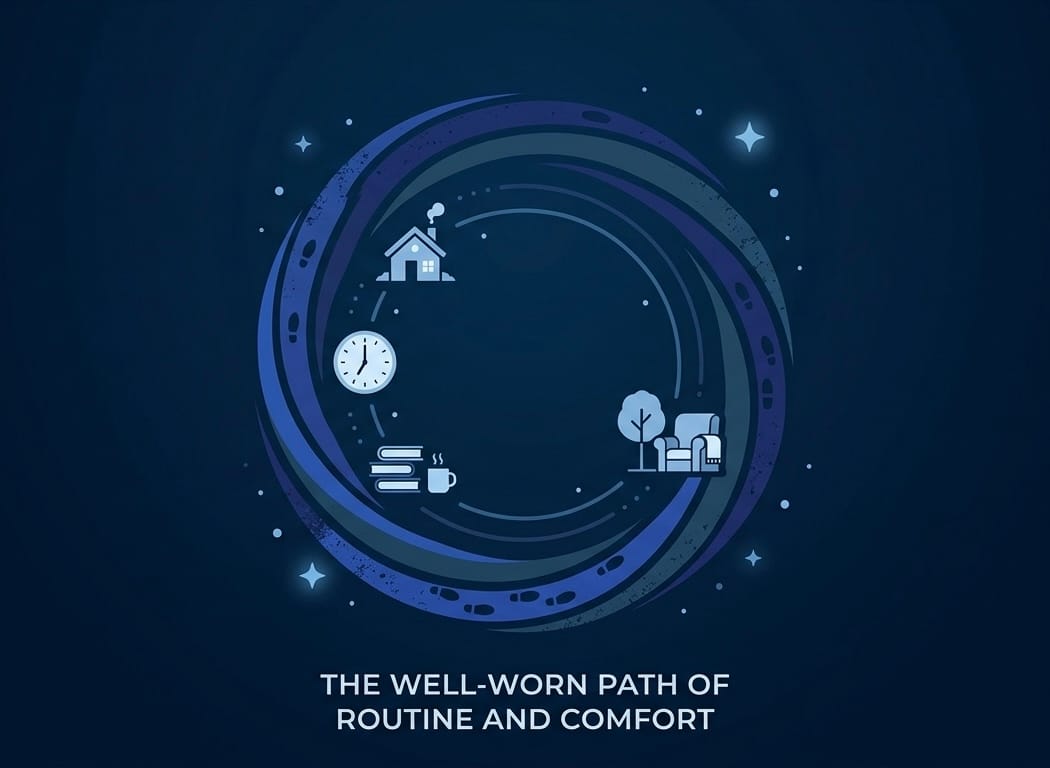
Force 4: Habit — The Gravity of the Familiar
Habit is the most underestimated force in product design. It's the invisible hand that keeps users in place long after they've stopped being happy.
Habit can come from:
- Muscle memory: They know where everything is
- Workflow integration: The tool is embedded in their daily routine
- Social habit: Their team uses it, and coordination is valuable
- Identity habit: "I'm a [Tool X] person" is part of their self-image
The designer's mistake: Teams think of Habit as laziness. It's not. Habit is cognitive efficiency. The human brain is wired to conserve energy, and switching tools requires enormous cognitive investment. Every new tool means relearning, reconfiguring, and re-explaining to colleagues.
Real-world example: Even when users acknowledged Claude's advantages, many thought: "I already know ChatGPT. My prompts are there. My history is there. My team uses it. Is it really worth rebuilding all of that?" Habit kept them anchored.
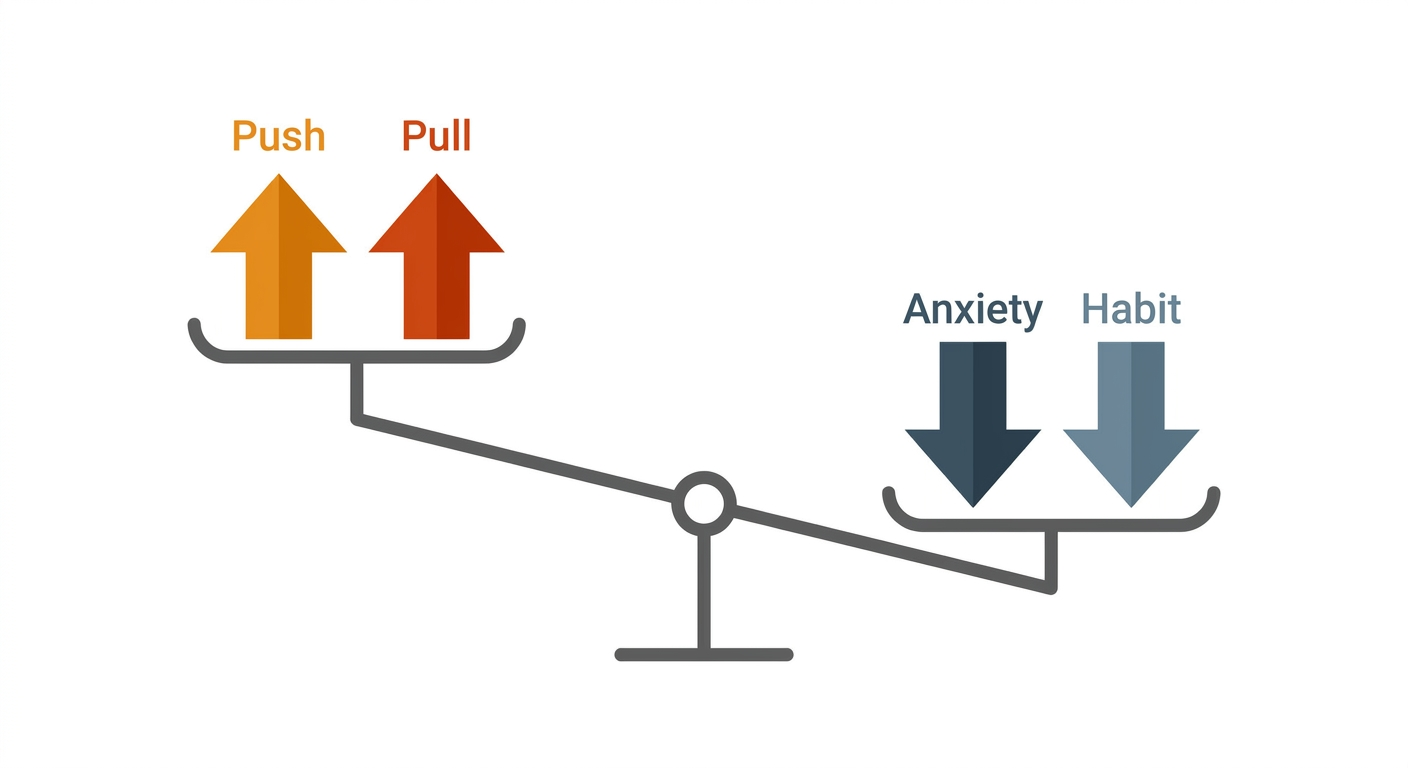
The Switching Equation
Here's how the four forces interact at the moment of decision:
SWITCH HAPPENS WHEN: Push + Pull > Anxiety + Habit
This is not a metaphor. This is a near-literal psychological equation. And it explains:
- Why users stay in terrible products: Anxiety + Habit > Push + Pull
- Why users suddenly switch: A tipping point where the balance shifts
- Why "better" products fail: Strong Pull, but Anxiety and Habit are stronger
- Why incumbents are so hard to displace: Habit is a compounding advantage
How I Apply This as a UX Designer
1. Map the Four Forces Before Designing Anything
Before I write a single user story or sketch a single screen, I map the four forces for our target user. This mapping tells me where to focus. If Push is weak, I need to help users feel the pain of their current situation. If Anxiety is high, I need to reduce switching risk. If Habit is strong, I need to make the transition seamless.
2. Design for Anxiety Reduction, Not Just Feature Parity
Most teams try to win on features. I try to win on risk reduction.
- Free trials that import existing data (reduces transition anxiety)
- Side-by-side migration (reduces loss anxiety)
- "Switch back" guarantees (reduces commitment anxiety)
- Social proof from similar users (reduces social anxiety)
- Familiar patterns and mental models (reduces learning anxiety)
The best onboarding I've ever designed wasn't the one with the most features. It was the one that made users feel safe.
3. Increase Push Through "Struggling Moment" Design
Sometimes users don't feel enough Push to switch. They're complacent. In these cases, I design for struggling moments, the points in the user's journey where the pain is most acute.
This isn't about dark patterns. It's about honestly surfacing the cost of inaction. Show them what they're losing. Make the invisible pain visible.
4. Attack Habit Through Habit Replacement
You can't destroy a habit. You can only replace it. So I design replacement rituals:
- Import their existing workflows so the new tool feels familiar
- Mirror the patterns they already know from their current tool
- Create new habits that are easier than the old ones
- Build social momentum so the new habit is reinforced by peers
5. Reverse-Engineer the Switch
Here's my favorite exercise: I take a product that successfully stole users from an incumbent (like Claude taking users from ChatGPT) and I reverse-engineer the four forces. This tells me exactly what I need to build, and more importantly, what I need to communicate, to make my product "switchable."
The Deeper Lesson: Design Is Not About Products. It's About Progress.
The Four Forces framework reveals something uncomfortable: users don't care about your product. They care about the progress they're trying to make in their lives.
Your product is just a vehicle. And they'll switch vehicles the moment they believe a different one will get them where they're going, with less risk and less effort.
As designers, our job isn't to build the most feature-rich product. It's to:
- Understand the progress the user is trying to make
- Reduce the forces that resist change (Anxiety + Habit)
- Amplify the forces that drive change (Push + Pull)
- Make the switch feel inevitable, not risky
That's it. That's the whole game.
A Note on the Framework's Origins
The Four Forces of Progress comes from the Jobs-to-Be-Done (JTBD) framework, pioneered by Clayton Christensen and further developed by Bob Moesta and Chris Spiek. It's been used by companies like Intercom, Basecamp, and Hudl to understand customer decision-making at a structural level.
What I've tried to do here is translate it from a research framework into a design practice, something you can use in your next sprint planning session, not just your next customer interview.
The Bottom Line
If you're a designer or product person reading this, here's my challenge:
I guarantee you'll find that your biggest opportunity isn't a feature. It's reducing anxiety. Or breaking a habit. Or helping users feel the pain of staying where they are.
The Four Forces won't tell you what to build. But they'll tell you why users aren't switching, and that's the most important question in product design.