SocialTalent: Enterprise Dashboard Strategy
Revamping SocialTalent: A Strategic Transformation of the Admin Dashboard
Role: Senior Product Designer (UX/UI lead)
Context: Business-to-Business (B2B) SaaS Platform
Outcome: 40% reduction in support tickets, 25% increase in administrative efficiency
The Strategic Challenge
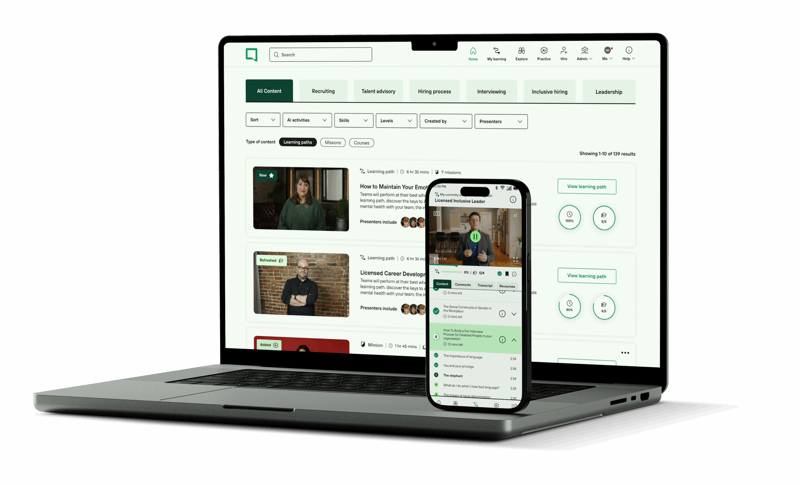
SocialTalent, a market leader in recruitment training, faced a scaling problem. Their legacy admin dashboard—the primary interface for Fortune 500 HR teams to manage learning at scale—was suffering from "feature creep" and significant technical debt. As a Senior Product Designer, my objective was not just to "redesign" the interface, but to fundamentally restructure the administrative experience to support global enterprise requirements.
Key Pain Points
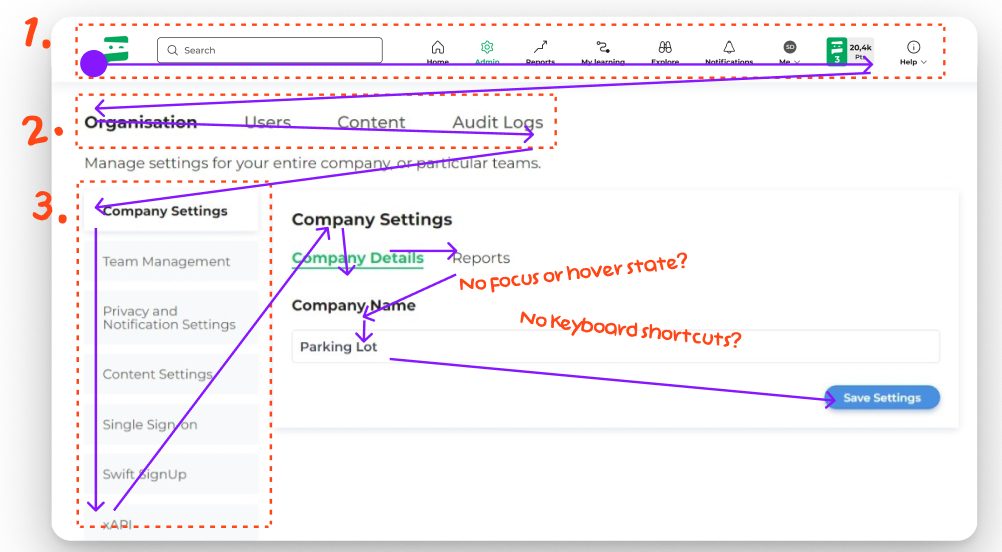
- High Cognitive Load: Information was presented without hierarchy, leading to decision paralysis.
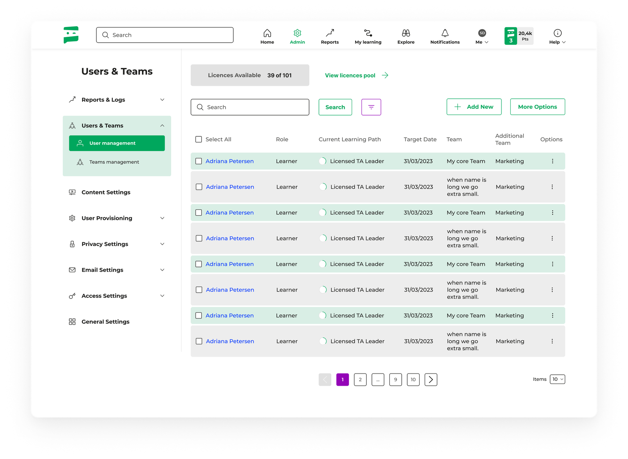
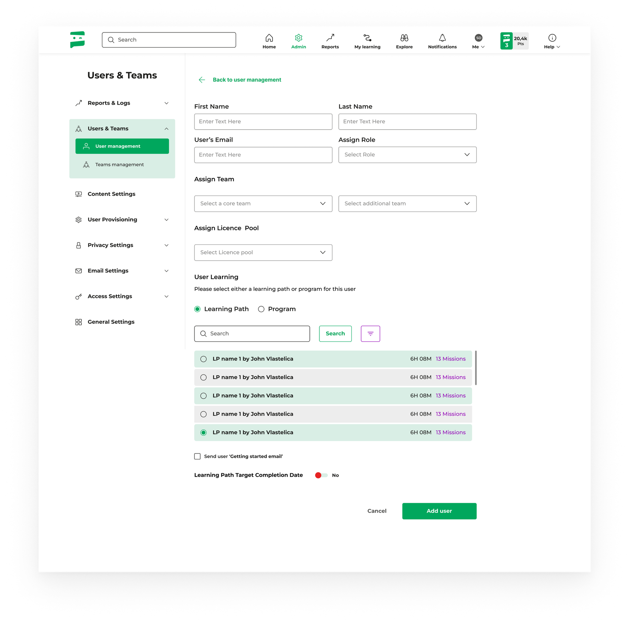
- Workflow Fragmentation: Routine tasks (e.g., inviting 500 users) required excessive clicks and page reloads.
- Data Inaccessibility: Analytics were buried, preventing admins from proving ROI to their stakeholders.
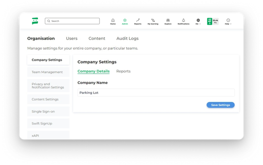
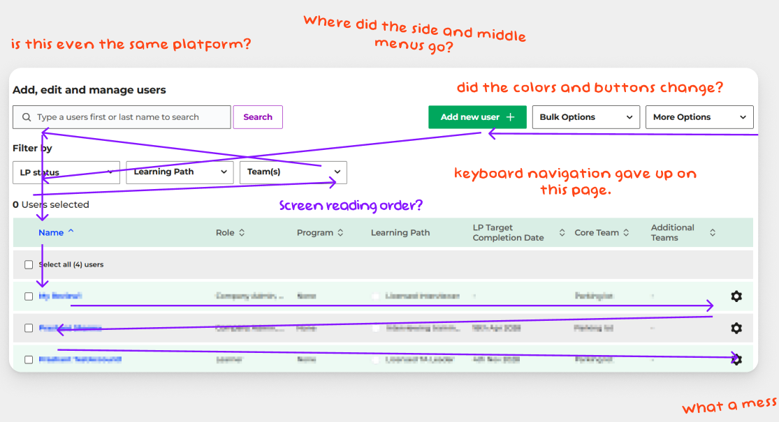
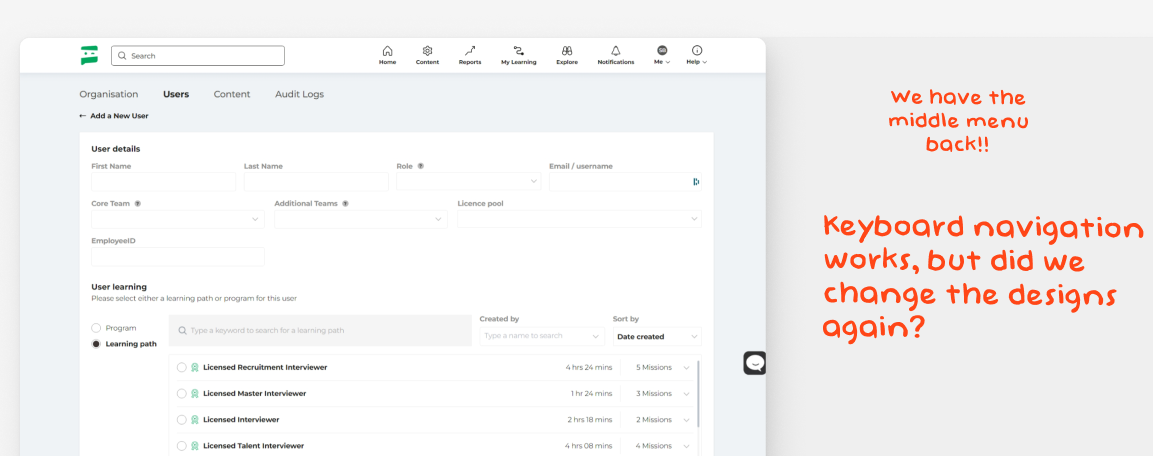
- Inconsistent Design Language: Multiple design eras co-existed, eroding trust and learnability.
Research & User Personas
I initiated a research phase involving deep-dive interviews with account managers and power users. We identified two distinct personas that dictated the architectural requirements of the platform.
- The Strategic Admin (HR Director): Focuses on macro-level data, engagement metrics, and ROI reporting.
- The Operational Admin (Team Lead): Focuses on micro-level tasks, user provisioning, and troubleshooting.
Information Architecture & System Thinking
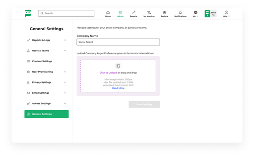
To solve the workflow fragmentation, I restructured the Information Architecture (IA). We moved away from a technical menu structure ("User Management," "Settings") toward a goal-oriented structure ("People," "Content," "Insights").
Iterative Design Process
Low-Fidelity Exploration
I utilized rapid wireframing to test layout assumptions. The core focus was the "Action Center"—a persistent area for common tasks that followed the user, reducing navigation time.
Visual Refinement & Accessibility
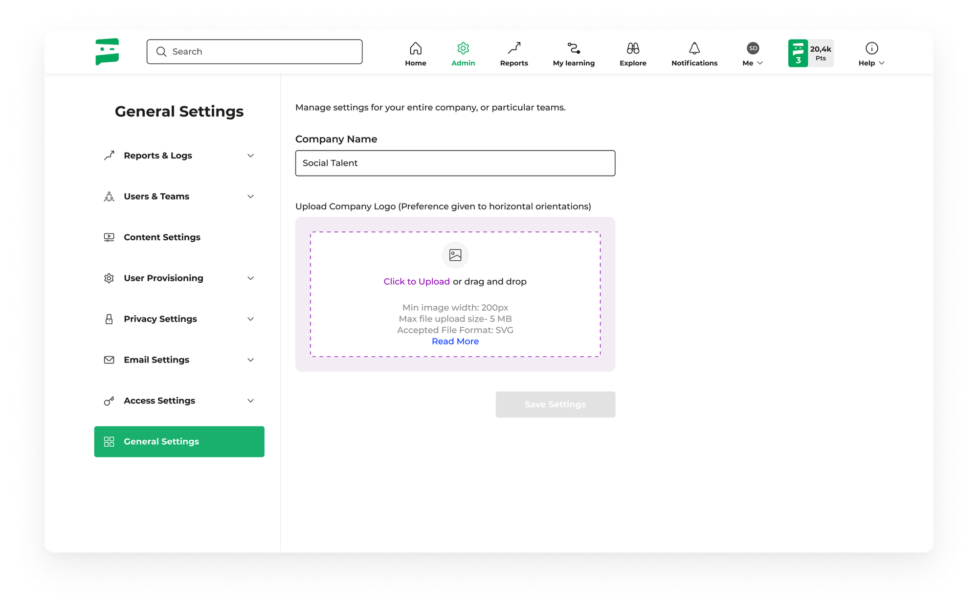
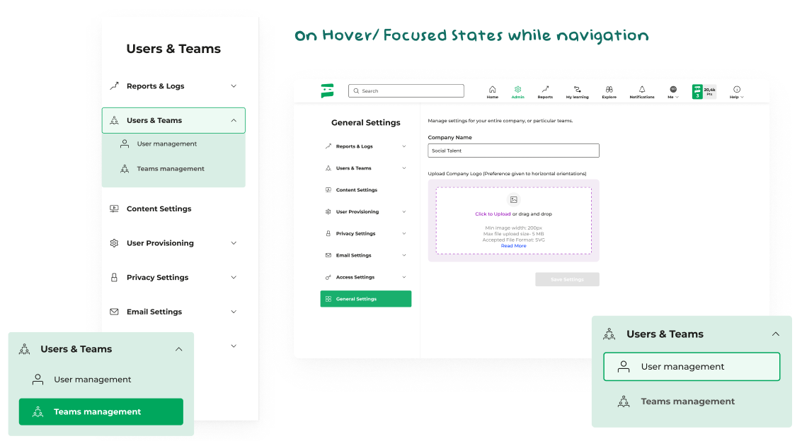
Moving into high-fidelity, I established a clean, high-contrast design system. We prioritized accessibility (WCAG 2.1 AA) and data visualization clarity. The dashboard was rebuilt using a modular grid system, allowing for responsive flexibility across enterprise-grade ultra-wide monitors and standard laptops.
The Solution: A Modular, Data-Driven Interface
The final solution introduced a "Glanceable Dashboard" for executives and a "Power Workflow" view for operators.
Key Design Interventions:
- Bulk Actions Framework: Simplified user management, reducing time-on-task for large cohorts by 65%.
- Contextual Analytics: Integrated data visualisations directly into management screens so admins can see impact without switching to a dedicated reports tab.
- State-Aware UI: Introduced loading and empty states that guide the user through their first-time experience.
Impact & Reflection
Post-launch metrics confirmed the success of the strategic overhaul:
- Efficiency: Time taken to onboard new user cohorts decreased from 12 minutes to 4 minutes.
- Support: 40% fewer "How-to" tickets received by the SocialTalent support team.
- Adoption: 15% increase in weekly active admin users within the first quarter.
This project reinforced a core belief of mine: Design is a business tool. By aligning user needs with enterprise scalability, we transformed a legacy burden into a competitive advantage for SocialTalent.