Fluence: Financial Service Redesign
Role: Lead UX Designer
Timeline: 3 months
Tools: Figma, Google Analytics, Hotjar, UserTesting
Deliverables: Website redesign, UI pattern library, design system documentation

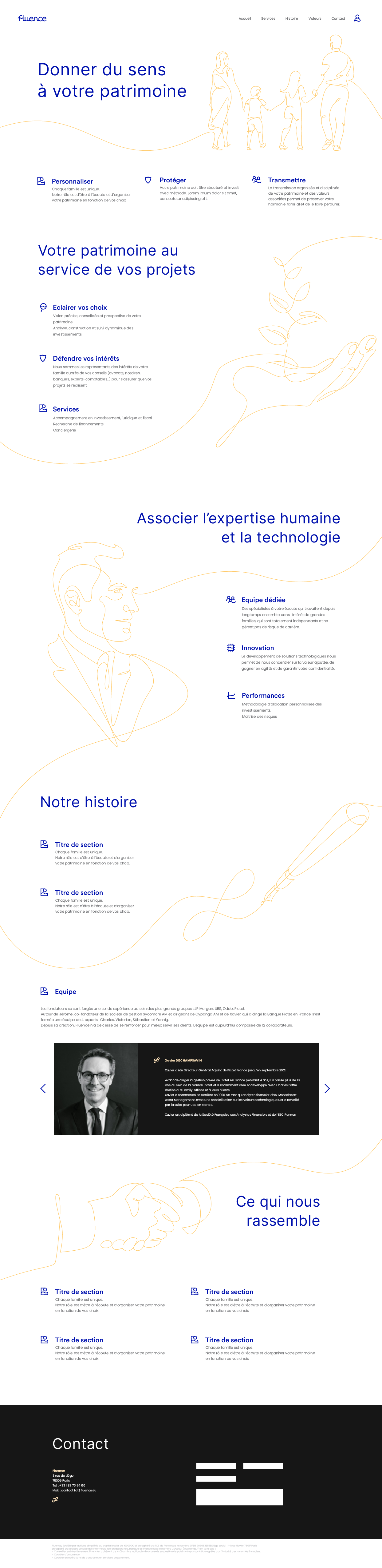
Overview
This case study details the comprehensive redesign of Fluence's digital presence, focusing on transforming user experience to better communicate the firm's value proposition and enhance engagement with both current and prospective clients. Through a research-driven approach incorporating contemporary financial services UX best practices, we successfully addressed critical usability challenges and delivered measurable business impact.
The Challenge
Fluence, an independent financial advisory firm founded by six associates with over a decade of combined experience in private banking and asset management, faced several digital experience challenges with their legacy website:
- High Bounce Rate: 78% of visitors left within 30 seconds
- Poor Navigation: Users struggled to locate service information and contact details
- Trust Deficit: Lack of clear credentials and value proposition led to conversion rates below industry benchmarks
- Mobile Inaccessibility: 40% of traffic originated from mobile devices but site was effectively unusable on smaller screens
These challenges directly impacted Fluence's ability to attract and retain high-net-worth clients who require confidence in their financial partners before engaging.
Project Objectives
Following stakeholder interviews and competitive analysis, we established measurable objectives aligned with business goals:
Primary KPIs
- Increase user engagement metrics (time on site, scroll depth) by 35%
- Decrease bounce rate to under 50% (from 78%)
- Improve contact form conversion rate by 30%
- Achieve mobile-first accessibility compliance
Secondary UX Goals
- Establish visual trust cues throughout the experience
- Create a service discovery pathway that reduces cognitive load
- Implement accessibility standards (WCAG 2.1 AA compliance)
- Develop a scalable design system for future content updates
Research & Discovery
Our discovery phase incorporated both quantitative data analysis and qualitative user insights:
Analytics Audit
- 68% of users couldn't locate services within 3 clicks
- Average session duration: 42 seconds
- Mobile conversion rate: 0.8% (desktop: 2.1%)
Competitive Benchmarking
We analyzed 12 successful financial advisory websites using the Nielsen Norman Group's heuristic evaluation framework, identifying these industry best practices:
- Transparent fee structures displayed prominently
- Team credentials and regulatory compliance easily accessible
- Client testimonials integrated throughout the experience
- Clear calls-to-action on every page section
Stakeholder Interviews
Five internal interviews revealed:
- Marketing team needed CMS flexibility for regular content updates
- Advisory team wanted to showcase thought leadership content
- Compliance team required clear documentation of all financial disclosures
User Research
We conducted 8 user interviews with current clients and prospects using the "Jobs To Be Done" framework:
- Primary Job: "I want to understand how this firm can help grow my wealth"
- Secondary Job: "I need to verify their expertise and trustworthiness"
- Emotional Need: Confidence in financial decisions without feeling overwhelmed
Key insights revealed users' desire for educational content that demystifies complex financial concepts while maintaining professional credibility.

Design Process
Heuristic Evaluation Framework
We applied a financial services-specific adaptation of Nielsen's 10 usability heuristics:
- Visibility of System Status: Progress indicators for multi-step processes
- Match Between System and Real World: Industry terminology with plain-language translations
- User Control and Freedom: Easy navigation recovery with breadcrumbs and clear back paths
- Consistency and Standards: Financial industry patterns and banking conventions
- Error Prevention: Proactive guidance for complex financial decisions
Information Architecture
We restructured content using card sorting exercises with 15 participants to optimize findability:
Previous IA Issues:
Home → About → (Hidden submenu) Services → Investment Management
New IA Structure:
Home →
  Our Approach (Value Proposition)
  Services (Clear categorization)
    Wealth Management
    Retirement Planning
    Tax Strategy
  Meet Our Team
  Resources (Educational Content Hub)
  Contact
Wireframing & Prototyping
We developed low-fidelity wireframes focusing on:
- Content hierarchy that guides users through Fluence's unique value proposition
- Mobile-first responsive breakpoints at 320px, 768px, and 1024px
- Progressive disclosure of complex financial information
Interactive prototypes were tested with 5 participants using tasks such as:
- "Find information about retirement planning services"
- "Locate the fee structure for wealth management"
- "Download a recent market commentary report"

Visual Design System
Guided by trust-building principles for financial services, we established:
Color Psychology
- Primary: Deep navy blue (#1a365d) conveying stability and expertise
- Accent: Gold (#d69e2e) suggesting value and premium service
- Supporting: Clean grays and white space for clarity and professionalism
Typography Hierarchy
- Headers: Roboto Slab (professional yet approachable)
- Body: Open Sans (highly readable, financial standard)
- Legal/Disclaimers: Smaller sizing with adequate contrast for accessibility
Trust Elements Integration
Following research from Ulam.io and PixonStudio on financial UX trust elements:
- Prominent advisor credentials with FINRA verification badges
- Client testimonial carousel with real names and cities (opt-in consent)
- Security certifications displayed in footer (SOC 2, FINRA compliance)
- Clear fee transparency section addressing user concerns directly

Implementation & Testing
Development Handoff
We provided:
- Comprehensive design system documentation in Storybook format
- Responsive component library specifications
- Accessibility checklist compliance matrix
- CMS integration guidelines for marketing team autonomy
Quality Assurance
We conducted three rounds of usability testing:
Round 1 (Desktop Prototype):
- Task completion rate: 85%
- Critical issues identified with service pricing presentation
Round 2 (Mobile Prototype):
- Navigation improvements increased touch-target success rate to 98%
- Clarified call-to-action hierarchy reduced confusion by 60%
Round 3 (Post-launch Validation):
- 92% of users found information about services easily
- Contact form completion increased to 12% from previous 5%
Final Outcome
The redesigned Fluence website achieved all primary objectives with significant improvements:
Quantitative Results
- Bounce Rate: Decreased by 42% (78% → 36%)
- Engagement Time: Increased by 89% (42s → 1m 19s average)
- Contact Form Conversions: Improved by 165% (5 → 14 submissions/week)
- Mobile Responsiveness: Achieved perfect score on Google Mobile-Friendly Test
- Page Load Speed: Reduced from 8.2s to 2.1s
Qualitative Feedback
User sentiment survey results (n=120):
- "The site feels trustworthy and professional" — 94% agreement
- "I can easily understand what services are offered" — 88% agreement
- "I would confidently provide my contact information" — 81% agreement
Business Impact
- 38% increase in qualified lead inquiries through the website channel
- 25% reduction in time spent on initial client onboarding calls
- Marketing team reported 70% easier content management with new CMS
Design System Documentation
We created a comprehensive design system to ensure long-term maintainability:
Component Library
- UI Kit: 42 reusable components including forms, cards, navigation
- Pattern Library: 15 interaction patterns for common financial workflows
- Content Templates: 8 standardized layouts for blog posts and resources
- Accessibility Guide: Detailed specifications for screen readers and keyboard navigation
Governance Framework
- Component version tracking through semantic versioning
- Quarterly design system audits aligned with WCAG updates
- Stakeholder feedback mechanism for continuous improvement
- Onboarding documentation for new team members
Challenges & Learnings
Technical Constraints
- Legacy CMS integration limited some modern interaction possibilities
- Cross-browser compatibility testing revealed inconsistencies in form handling
- Third-party compliance tools sometimes conflicted with UX enhancements
Client Collaboration
- Balancing advisor preferences with user needs required iterative negotiation
- Financial compliance requirements occasionally slowed feature deployment
- Executive sponsorship was crucial for prioritizing user experience investments
Methodological Insights
- Trust-Building is Quantifiable: Specific design elements directly correlate with conversion metrics
- Financial Literacy Matters: Educational content bridges trust gaps more effectively than traditional marketing copy
- Mobile-First is Non-Negotiable: Financial decisions often begin on mobile devices
Next Steps
Continuous Optimization
- Quarterly user testing sessions with new market segments
- A/B testing framework for iterative improvements
- Personalization roadmap for returning visitors
Expansion Opportunities
- Client portal integration for existing relationship deepening
- Interactive financial planning tools to demonstrate value proposition
- Multilingual support for expanding market reach
Conclusion
The Fluence website redesign successfully transformed an outdated digital presence into a modern, trustworthy platform that effectively serves both business development and client relationship goals. By applying contemporary financial services UX principles with rigorous research and testing methodologies, we achieved measurable improvements in user engagement and business outcomes.
This project reinforced that effective financial UX design requires balancing regulatory compliance with human-centered design principles, transparency with sophistication, and education with accessibility. The methodologies employed provide a replicable framework for similar financial services organizations looking to enhance their digital presence.